
提示词美学解码 × 新粗野主义:反AI味!Prompt Aesthetics Decoded × New Brutalism: Double AI Flavor!
17 分钟阅读17 min read
本页目录On this page
现在很多官网长得越来越像同一个模板:柔和渐变、圆角卡片、玻璃拟态。
虽然看起来精致,如果只看一张截图,很难分清是哪家产品,更有甚者,vibe一个界面就拿出来了,丑的让人看不下去。
而另一批 AI 工具、开发者产品和内容封面却走向另一个风格:粗黑边框、硬投影、撞色色块、巨大的标题字。界面充满了”不规范”的奔放风格,反而更容易被记住。
这套视觉语言的名字借自半个多世纪前的建筑学——粗野主义。从建筑到平面、网页、产品界面,发展至今,已经形成了其独特的风格。
一、新粗野主义的两次转折
2014,网页设计里的反抗

2014 年,设计师 Pascal Deville 建了 Brutalist Websites,专门收录一批「反常规」的网页设计,两年后这个说法开始流行。
Deville 的形容是「一种不在乎自己看起来舒不舒服的粗粝感」——是对当时主流网页设计的反抗:太多网站为了讨好用户,把界面做得过度轻盈讨喜,个性被磨平了。这批网站故意保留原始的 HTML 排版感,不加圆角,不加阴影,拒绝模板化精修。
2021,产品界面里的系统化

2021 年 Gumroad 的改版,让这套视觉变成今天能一眼认出的样子:创始人 Sahil Lavingia 把界面推倒重做,粗黑边框,扁平高饱和主色,向右下偏移的硬投影。几个月内,Figma 社区冒出大量同款风格的 UI 组件库。2022 年,设计师 Michał Malewicz 写文章把这套视觉正式命名为 Neubrutalism。
它和建筑粗野主义的差别在于:建筑粗野主义展示的是真实结构,新粗野主义的粗糙是被重新设计过的,边框多粗、阴影多硬、色块怎么撞,都是精确控制的结果,目的是让用户第一眼觉得这个产品诚实、直接、能用。
网页粗野主义展示真实态度,新粗野主义让 UI 展现出新的表达风格。
二、提示词拆解:文章封面 / 观点封面
文章封面不用做成完整 UI,借标题、边框、色块和组件感,让一个观点看起来像可点击的工具。适合用 AI 生图——巨大文字,重边框,阴影。
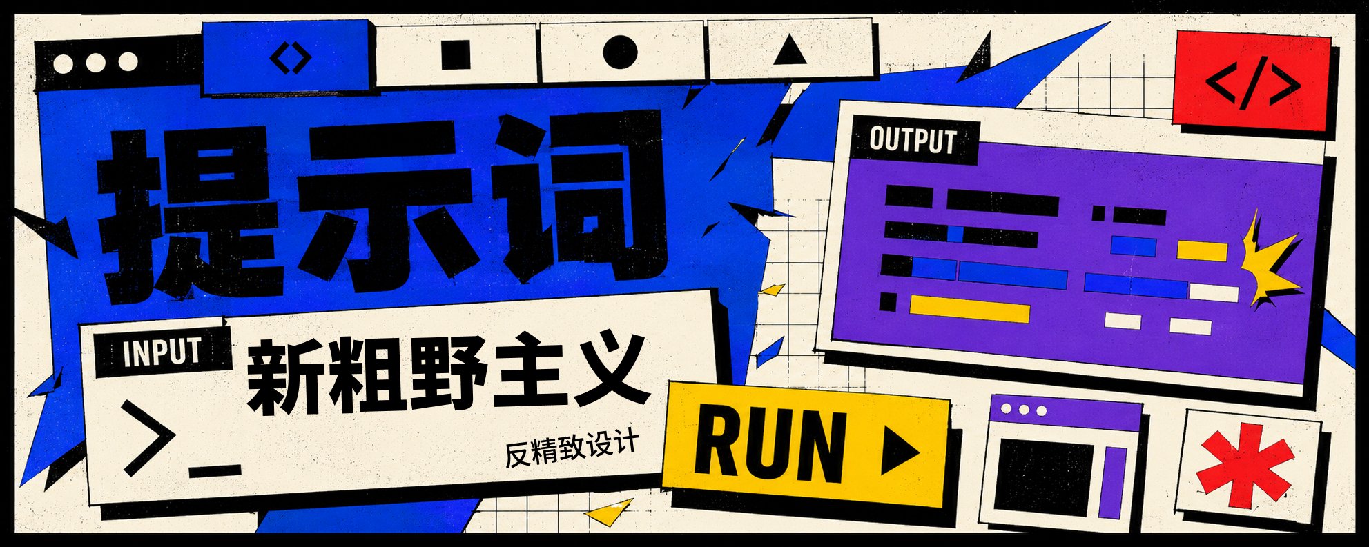
01|本文封面|爆裂式断裂网格|标题「新粗野主义」

02|AI Agent 自动化|破损开关 + 系统告警贴纸|标题「Loop Engineer」

03|Prompt 方法论 / 提示词工程|网页界面式构图|标题「提示词」

04|内容资产系统|混乱到有序的转化|标题「资产」

文生图|复制即用:通用文章封面提示词
文章主题或摘要:
{输入文章标题、摘要,或直接粘贴文章内容}

用途:
{例如:文章封面}

画幅:
横版 5:2(固定)

指定主标题文字:
{可选;没有就写:自动判断}

特殊要求:
{指定颜色、图形隐喻,或不能出现的元素;没有就写:无}

Create a neo-brutalist article cover poster.

Aspect ratio: 5:2 landscape banner.

Main visual:
One dominant object or interface-like metaphor (a button, a toggle, a broken grid fragment, a card shape), surrounded by offset sticker-like UI cards, tags, and small warning-style labels.

Style lock:
neo-brutalist digital graphic design, thick black borders, hard offset drop shadows, flat bold color blocks, broken grid layout, oversized typography, sticker-like interface elements, raw web aesthetic, anti-polish, playful but structured.

Typography:
One large bold headline, using the text specified above (if left as "自动判断", match the language of the topic/summary given above). Add at most one small supporting label. Do not create fake or unreadable UI text.

Composition:
Asymmetrical layout, one dominant object, overlapping smaller cards and stickers, visible grid disruption, strong negative space, hard-edged geometry.

Color:
High-contrast flat colors — pick 3-4 from off-white, black, cobalt blue, bright yellow, red, purple. No gradients.

Texture:
Slight print grain, matte digital poster feel.

Avoid:
glassmorphism, soft gradient SaaS look, glossy 3D, realistic scene, full complex dashboard, stock-photo style.
三、方向 B:AI 工具 / 产品视觉
- Gumroad — https://gumroad.com/ |厚黑边框、硬偏移阴影、扁平撞色块、超大标题,被多篇设计指南称为 neubrutalism 的「海报儿童」
- RetroUI 官网 — https://retroui.dev/ |NeoBrutalism React + Tailwind 组件库的官方演示站
- Panda CSS — https://panda-css.com/ |开发者向构建时样式库官网,块状营销页 + 原始硬朗美学
可直接拿来搭页面的组件库
- Logging-Studio/RetroUI — https://github.com/Logging-Studio/RetroUI |1.5k star
- ANIBIT14/boldkit — https://github.com/ANIBIT14/boldkit
- ekmas/neobrutalism-components — https://github.com/ekmas/neobrutalism-components |5.2k star
画廊入口
- Webflow — Made in Webflow: Neobrutalism — https://webflow.com/made-in-webflow/neobrutalism |收录大量可直接 clone 的真实上线站点
示例|AI 提示词管理工具定价页|标题「PROMPT OS」

文生图|复制即用:产品/工具视觉概念示意图提示词
产品或主题说明:
{输入产品名、功能介绍,或文章主题}

用途:
{例如:官网首屏 / Dashboard 概念图 / Pricing 页}

画幅:
横版 5:2(固定)

指定标题文字:
{可选;没有就写:自动判断}

特殊要求:
{指定颜色、组件、不能出现的元素;没有就写:无}

Create a neo-brutalist SaaS landing page hero illustration.

Aspect ratio: 5:2 landscape banner.

Main visual:
Turn the product/theme into a product page, tool interface, dashboard fragment, or pricing block, with several input fields, buttons, toggles, tabs, status labels, or pricing cards overlapping in a broken-grid layout — not just one isolated element.

Style lock:
neo-brutalist UI illustration, raw interface blocks, thick black outlines, hard offset drop shadows, flat bold color blocks, broken grid, oversized buttons, sticker-like tags, high contrast, playful but structured, anti-polish.

Typography:
Large bold title, using the headline text specified above (if left as "自动判断", match the language of the product/theme description given above), plus 2-3 short supporting labels (e.g. button or tab text). Do not create fake UI labels or unreadable microcopy.

Composition:
Asymmetrical layout, multiple overlapping cards and blocks, visible grid disruption, one dominant element, deliberate not messy.

Color:
Bright flat colors — pick 3-4 from off-white, black, signal yellow, cobalt blue, red, purple, green. No gradients.

Texture:
Slight print grain, matte digital poster feel.

Avoid:
glassmorphism, soft shadows, glossy 3D, Apple-style clean UI, blue-purple gradient SaaS look, cinematic lighting, realistic office scene, generic laptop mockup, stock-photo style.
四、方向 C:开发者 / 开源项目
- Panda CSS — https://panda-css.com/ |营销页本身就是新粗野主义
- RetroUI 官网 — https://retroui.dev/ |同时也是开发者视觉的例子
可直接引用/截图的 GitHub 项目
- khangtrannn/ng-brutalism — https://github.com/khangtrannn/ng-brutalism |Angular,2026-06 更新
- Bridgetamana/neobrutal-ui — https://github.com/Bridgetamana/neobrutal-ui |Base UI + Tailwind
- matifandy8/NeoBrutalismCSS — https://github.com/matifandy8/NeoBrutalismCSS |极简 CSS 框架
- ComradeAERGO/Awesome-Neobrutalism — https://github.com/ComradeAERGO/Awesome-Neobrutalism |精选资源索引,适合做延伸阅读入口
示例|开源 CLI 工具主页|标题「TERMINAL KIT」

文生图|复制即用:开发者视觉概念示意图提示词
项目或教程说明:
{输入开源项目名、API 名称,或技术教程主题}

用途:
{例如:GitHub 封面 / 文档封面 / 技术教程配图}

画幅:
横版 5:2(固定)

指定标题文字:
{可选;没有就写:自动判断}

特殊要求:
{指定颜色、需要保留的品牌标识,或不能出现的元素;没有就写:无}

Create a neo-brutalist website interface concept.

Aspect ratio: 5:2 landscape banner.

Main visual:
A full-screen web layout combining a terminal window or code-card shape with misaligned content cards, navigation tabs, module tags, and status-label blocks. Do not render real, readable code — use abstracted blocky text lines instead.

Style lock:
neo-brutalist web design, thick black outlines, hard offset drop shadows, flat color panels, broken grid, raw HTML-inspired layout, oversized typography, high contrast, deliberately unpolished but usable.

Typography:
Large bold title, using the headline text specified above (if left as "自动判断", match the language of the project/tutorial description given above), monospace-flavored accents allowed for tags/labels only, plus 2-3 short supporting labels.

Composition:
Desktop landing page layout, asymmetrical grid, cards overlapping slightly, one dominant terminal/code block, visible block structure.

Color:
High-contrast flat colors, dark terminal background or off-white/black base allowed — pick 3-4 accent colors, no gradients.

Texture:
Slight print grain, matte digital poster feel.

Avoid:
glassmorphism, soft gradient SaaS look, realistic IDE screenshot, readable real code, glossy 3D, cyberpunk neon, stock-photo style.
五、出图判断
反精致不等于乱:表面可以粗,结构不能乱。信息层级多、要讲清楚多步流程时别用新粗野主义——它负责建立记忆点和态度,不负责装下所有信息。
neubrutalism.com 把它现在的状态总结成一个词:Anti-AI Signal——手作感、原始感的视觉,本身就是对抗 AI 同质化的信号。AI 官网越来越像同一个模板,新粗野主义好用,恰恰因为它足够「不像 AI」
六、实践案例
借此机会,也分享一下自己的实践案例。一款我自己独立开发的桌面端的时间记录工具👇(Seedo-时间种子): FANzR-arch: Seedo
风格:薄荷绿为主色+新粗野主义UI

4月10日
本篇“新粗野主义”分享完,最初起源于建筑学的“传统粗野主义”,也将在下篇展开,感谢支持。

🥳感谢看到这里,我是阿哲Phil,“一个自由的提示词诗人”
欢迎关注我 @Formulasearch,我会持续分享:用AI解码美学 × AI实践 × 增长心得,欢迎与我交流。