
提示词美学解码 × Plakatstil:单物体视觉Prompt Aesthetics Decoded × Plakatstil: The Single-Object Visual
22 分钟阅读22 min read
本页目录On this page
很多 AI 封面图,有光、有质感、有构图,也有一堆看起来高级的风格词。但画面里没有一个能被记住的主语。读者滑过去以后,只剩下一种模糊印象:好像挺精致,但不知道讲什么。
Plakatstil 风格值得拆解的地方就在这里
一、先把主题变成一个物体

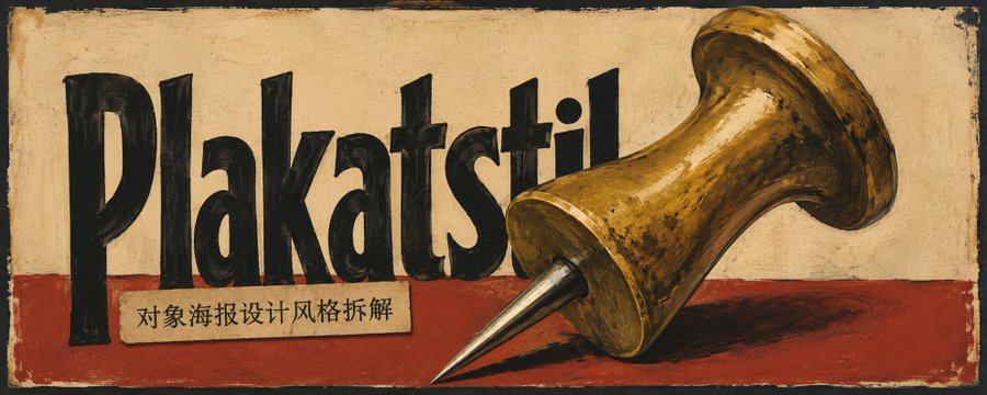
Plakatstil (对象海报设计风格) 是 20 世纪初德国广告海报里的一种视觉方法,常和 Sachplakat,也就是「物体海报」一起讨论。它的画面逻辑很直接:删掉复杂场景,删掉故事背景,删掉长文案,只保留一个被强烈简化的商品或物体,再配一个极短的名称。
最常被提到的案例,是 Lucian Bernhard 的 Priester 火柴海报。
画面里没有抽烟的人,没有商店,没有街景,也没有一堆广告语。只有两根火柴和一个产品名。

这就是它对 AI 封面的启发:
封面不是摘要,而是一个能被记住的视觉主语。
一篇文章讲搜索,可以变成一只放大镜。讲解锁流程,可以变成一把钥匙。讲一键启动,可以变成一个开关。主题越抽象,越需要一个具体物体把它钉住。
二、文章封面的运用
中推圈里常见的 AI 相关话题,很多都绕着「赚钱」展开:信息差包装、AI Agent 自动化、卖教程模板、内容矩阵变现。下面四个演示图,都是把抽象主题翻译成一个可记住的物体。
提示词可以比传统商品海报多保留一行小副标题,暗示读者这篇内容为什么值得点开或收藏。
01|AI 副业变现| 一叠钞票
一篇讲 「AI 副业分享,然后包装成可卖的东西」 的文章,可以直接用一叠厚厚的纸币做主角。配两个中文大字 变现。读者先记住现金,再理解文章在教怎么把知识变成第一桶金。


02|AI Agent 自动化|金属齿轮
一篇讲 「普通人用 AI Agent 跑通自动化系统,实现半被动收入」 的文章,不需要画流程图。它可以变成一个巨大的金属齿轮,配中文短词 自动。齿轮代表持续运转的赚钱机器。


03|AI 提示词和教程|商品包装盒
一篇讲 「AI分享教程、提示词模板、实操指南卖数字产品」 的文章,可以用一个商品包装盒做视觉主角。中文短词 售卖 直接印在包装标签上。盒子本身就是待售的产品。


04|内容增长|扩音器
一篇讲 「AI 批量生成内容 + 多平台分发矩阵变现」 的文章,可以用一个老式黄铜扩音器做主语。中文短词 触达 放在扩音器后方。暗示声音被放大,内容被更多人听到并付费。


这些图的共同点是:每张图都先替文章选了一个能直接被记住的「主题相关」物体。
文生图|复制即用:文章封面提示词
如果你只想直接生成封面,用下面这条就够了,复制后,把自己的文章主题和特殊要求填进去即可。 AI 会根据你的文章主题,完成主题理解、物体选择,然后生成图片。
文章主题或摘要:
{输入文章主题、标题、摘要,或直接粘贴文章内容}

用途和比例:
{例如:文章封面,横版 5:2}

指定主标题文字:
{可选;没有就写:自动判断}

指定副标题文字:
{可选;没有就写:自动判断或不加}

特殊要求:
{指定物体、颜色、不能出现的元素;没有就写:无}

Create an AI article cover from the text theme above.

Style lock:
early 20th-century German Plakatstil / Sachplakat advertising poster, hand-painted commercial object poster, one concrete commercial object, simplified but recognizable product hero, custom hand-painted advertising lettering, matte printed paper, visible paper grain, ink absorption, uneven hand-painted color coverage.

Image logic:
Read the article theme and translate it into one memorable physical object. The object can be a product, tool, folder, ticket, package, label, machine part, office item, container, stamp, megaphone, magnifying glass, key, switch, or another suitable concrete metaphor. Keep only one dominant object. Do not turn the image into a scene, flowchart, dashboard, UI screenshot, character group, or complicated information structure.

Typography:
If a main title is specified above, use that exact Chinese text. If it says “自动判断”, extract a short Chinese main title from the theme, usually 2-4 Chinese characters. Add one smaller subtitle only when it helps explain the article value or guide reading; if the image is stronger without a subtitle, omit it. All text must look like custom hand-painted commercial display lettering, not a modern font.

Layout and background:
Let the image model choose the strongest Plakatstil composition inside this boundary: the object may be centered, cropped, diagonal, edge-entering, label-led, printed on packaging, placed over large lettering, or partly covering the title. The background may use plain paper, dark field, color bands, large color blocks, worn border, simple pattern, or generous empty space. Keep the object dominant and the title readable.

Color and texture:
Choose the palette freely from the article theme and object. Colors must feel like painted or lithographic poster inks on paper, with visible paper fibers, matte ink, slight lithographic misregistration, rough hand-painted edges, uneven pigment coverage, and a unified printed poster surface.

Controlled freedom:
Do not use a fixed template for composition, palette, title position, subtitle position, or background. Vary the object metaphor, crop, title shape, background structure, color contrast, and subtitle use when generating multiple options, while keeping one-object Plakatstil logic stable.

Avoid:
clean vector icon, modern UI, search bar interface, infographic, flowchart, dashboard, Swiss grid, Bauhaus geometry, photorealistic product render, glossy 3D, cinematic lighting, neon glow, cyberpunk style, crowded body copy, long slogans, multiple competing objects, QR code, barcode, random labels, fake Chinese characters, wrong title text, English replacement text, more than one subtitle line.
三、产品宣传图的运用

如果上世纪20年代,就有这些电子产品,那么其海报可能是这样的风格?
这里的重点不是给产品套一层复古滤镜,而是把它当成旧广告里的商品:只保留一个核心物体,让轮廓、标签、品牌字、色块和纸张质感共同完成识别。
图生图|复制即用:任意物品转宣传图提示词
上传图片:
{上传一张商品、包装、工具、设备、物品或产品照片}

用途和比例:
{例如:产品宣传图,横版 5:2 / 方图 1:1 / 竖版 4:5}

指定广告标题文字:
{可选;可以写商品名、品类名或短标题;没有就写:自动判断}

指定副标题文字:
{可选;没有就写:自动判断或不加}

特殊要求:
{需要保留的品牌、颜色、标签、材质、角度,或不能出现的元素;没有就写:无}

Use the uploaded product or object photo as the source image and transform it into an early 20th-century German Plakatstil / Sachplakat advertising poster.

Style lock:
hand-painted commercial object poster, one dominant product hero, simplified but recognizable silhouette, custom hand-painted advertising lettering, matte printed paper, visible paper grain, ink absorption, uneven hand-painted color coverage.

Preserve the object's most recognizable identity: silhouette, material, functional parts, main label hierarchy, packaging marks and distinctive proportions. Simplify it into one dominant hand-painted commercial product hero.

Image logic:
Keep only one core object from the uploaded image. Preserve brand marks, labels, packaging hierarchy, distinctive materials and functional details when they matter to recognition. Remove modern lifestyle context, desks, UI screens, complicated backgrounds and extra props unless they are essential to the product identity.

Typography:
If advertising title text is specified above, use that exact text. If it says “自动判断”, create one short hand-painted advertising word based on the product name, category, visible label, or main selling idea. If the product already has label typography, let it participate in the poster. Add at most one smaller subtitle line.

Layout and background:
Let the product be centered, cropped, diagonal, label-led, edge-entering, package-close-up, printed-on-label, or placed over large hand-painted lettering, whichever creates the strongest old commercial poster. Background may use product-derived colors, dark field, aged paper, color bands, large blocks, simple patterns, worn border, or empty space. Keep clear object recognition.

Color and texture:
Choose the palette from the uploaded object, label, packaging, or a strong contrast poster field. Colors must feel like painted or lithographic poster inks, not digital gradients. Use matte paper, visible paper grain, ink absorption, uneven hand-painted color coverage, rough painted edges, slight lithographic registration shift and a unified printed poster surface.

Controlled freedom:
Do not force one fixed layout or palette. Let the product angle, crop, title placement, background family, decorative marks and color contrast adapt to the uploaded object, while preserving the object's identity and the Plakatstil commercial object logic.

Avoid:
photorealistic product render, modern launch poster, clean vector icon, sterile sans-serif typography, Swiss grid, Bauhaus geometry, glossy 3D, cinematic lighting, dashboard UI, lifestyle scene, multiple competing products, QR code, barcode, fake labels, fake Chinese characters, wrong title text, random unreadable small text.
四、延伸尝试:人物形象与个人网站
严格说,人物形象转绘已经不再是标准的 Sachplakat「物体海报」,更接近 Plakatstil-inspired 的人物服务海报。它适合用在个人账号、课程、咨询服务、讲座海报这类场景。

图生图|复制即用:人物转绘提示词
根据我上传的图像进行重绘

用途和比例:
{例如:个人账号海报,竖版 4:5 / 方图 1:1 / 横版 5:2}

指定主标题文字:
{可选;可以写名字、品牌名或账号名;没有就写:自动判断}

指定副标题文字:
{可选;可以写身份、服务、口号;没有就写:自动判断或不加}

特殊要求:
{需要保留的发型、服装、姿态、表情、颜色,或不能出现的元素;没有就写:无}

Use the uploaded portrait photo as the source image and transform the person into a Plakatstil-inspired early 20th-century advertising portrait poster.

Style lock:
Plakatstil-inspired service poster, simplified hand-painted portrait, one hero figure, custom hand-painted advertising lettering, matte printed paper, visible paper grain, ink absorption, uneven hand-painted color coverage.

Preserve the person's core identity: face shape, hairstyle, pose direction, clothing silhouette and one distinctive expression or gesture. Simplify the face and clothing into hand-painted poster shapes, with bold silhouette, limited highlights and strong graphic readability.

Image logic:
This is not strict Sachplakat product advertising. Treat it as a Plakatstil-inspired personal, service, performer, lecture, course, creator or consultant poster. Keep one person as the hero figure. Add one small trade object, badge, label, or service cue only if it clarifies the role.

Typography:
If main title text is specified above, use that exact text. If it says “自动判断”, create a short hand-painted title from the person's name, brand, account identity, or service role. If subtitle text is specified, use one smaller subtitle line. All lettering should be hand-painted, irregular, poster-like and commercial, not modern sans-serif, not comic book lettering.

Layout and background:
Let the portrait be cropped close, half-body, edge-entering, centered, diagonal, paired with large lettering, placed over color blocks, or arranged with a small service label, whichever creates the strongest vintage service poster. Background may use dark field, aged paper, color blocks, border, simple pattern, or strong negative space.

Color and texture:
Choose the palette freely from the portrait, clothing, identity, or desired poster mood. Colors must feel like painted or lithographic poster inks on paper. Use rough early lithograph paper, visible ink absorption, matte ink, subtle paper grain, imperfect contour lines, slight print registration shifts and a unified hand-painted poster surface.

Controlled freedom:
Do not force one fixed portrait crop, palette, or title position. Let the face simplification, crop, lettering placement, background structure and color contrast adapt to the uploaded portrait, while preserving the person's identity and the old hand-painted advertising poster logic.

Avoid:
photorealistic portrait, modern influencer poster, cinematic lighting, anime style, comic book style, luxury fashion ad, clean vector portrait, sterile sans-serif typography, Swiss grid, Bauhaus geometry, excessive grunge, extra slogans, fake Chinese characters, wrong title text, random unreadable small text.
其他尝试:个人网站的风格参考
如果只是借用配色、手绘字、纸张质感和广告感构图,个人网站也可以拿 Plakatstil 当视觉参考。但这已经是风格迁移,不属于严格的物体海报用法。

五、直接用 Skill 生成
如果你想要更稳的版本,可以直接调用本项目的 Plakatstil prompt skill:
FANzR-arch/image-prompt-skills
Skill 版更像是一个提示词编译器。你可以给它文章主题、完整文章、商品照片、包装照片、人物照片或参考图,它会自动做四件事:
- 判断输入类型:文字主题、商品照片、包装照片、人物服务海报,还是风格评估。
- 提炼画面主角:把抽象主题转成一个具体广告物体。
- 选择提示词模块:主体、字体、版式、背景、色彩、纸张和油墨质感。
- 组装完整提示词:输出一条已经决策好的、没有歧义的最终 prompt。
🥳感谢看到这里,我是阿哲Phil,“一个自由的提示词诗人”
欢迎关注我 @Formulasearch,我会持续分享:用AI解码美学 × AI实践 × 增长心得,欢迎与我交流。